You are here:
- Home »
- Using evidence for learning »
- Reading and analysing data »
- Pie graph
Pie graph
A pie chart (or a circle graph) is a circular chart divided into sectors, illustrating proportion.
Pie charts are best to use when trying to compare parts of a whole, for example the proportion of students who have achieved different levels or grades on an assessment, or in overall teacher judgments. They do not show changes over time.
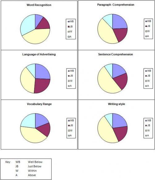
Pie graph from STAR data
What the data shows:
- Approximately 25% of students are well below or just below for Word Recognition.
- 35 – 40% are well below or just below for Sentence Comprehension, Paragraph Comprehension and Vocabulary Range.
- Approximately 40% of students are well below or just below for Writing Style and more than 50% are well below or just below for the Language of Advertising.
Overall focus for teaching reading to this group of students:
- Concentrate particularly on paragraph comprehension, the language of advertising and writing style, as these are the areas with the highest number of ‘well below’ levels.


