You are here:
- Home »
- Using evidence for learning »
- Reading and analysing data »
- Line graph
Line graph
Line graphs are used to track changes over periods of time. When smaller changes exist, line graphs are better to use than bar graphs. Line graphs can also be used to compare changes over the same period of time for more than one group.
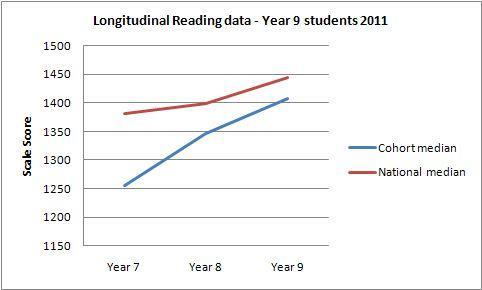
The graph illustrated tracks the median achievement for a cohort of students over three years. It would be equally possible, with available data, to graph the achievement of individual students on a line graph. For students to see graphical evidence of improvement is a very powerful incentive.
What the data shows
- The median achievement of these students in year 7 was below the national median by almost 150 points on the scale score.
- The median achievement in year 8 was below the national median by just under 50 points.
- The median achievement in year 9 was below the national median by approximately 40 points.
- The median achievement of this cohort is improving against the national median.
Area for investigation
Find out what the discrepancy in scale scores means in terms of year or curriculum levels.
Overall goal for this group of students
To continue the improvement in order to reach the national median by year 10.


