You are here:
- Home »
- Using evidence for learning »
- Reading and analysing data »
- Box and whisker graph
Box and whisker graph
A box-and-whisker graph or box plot is a convenient way of comparing groups of numerical data. Simply expressed, the lower whisker represents the bottom 25% of scores, the box represents the middle 50% of scores and the upper whisker the top 25% of scores. The line across the box shows the median score for the data set. Some box-and-whisker graphs, like the one illustrated below, show outliers. These are scores which deviate markedly from other scores in the sample in which they occur.
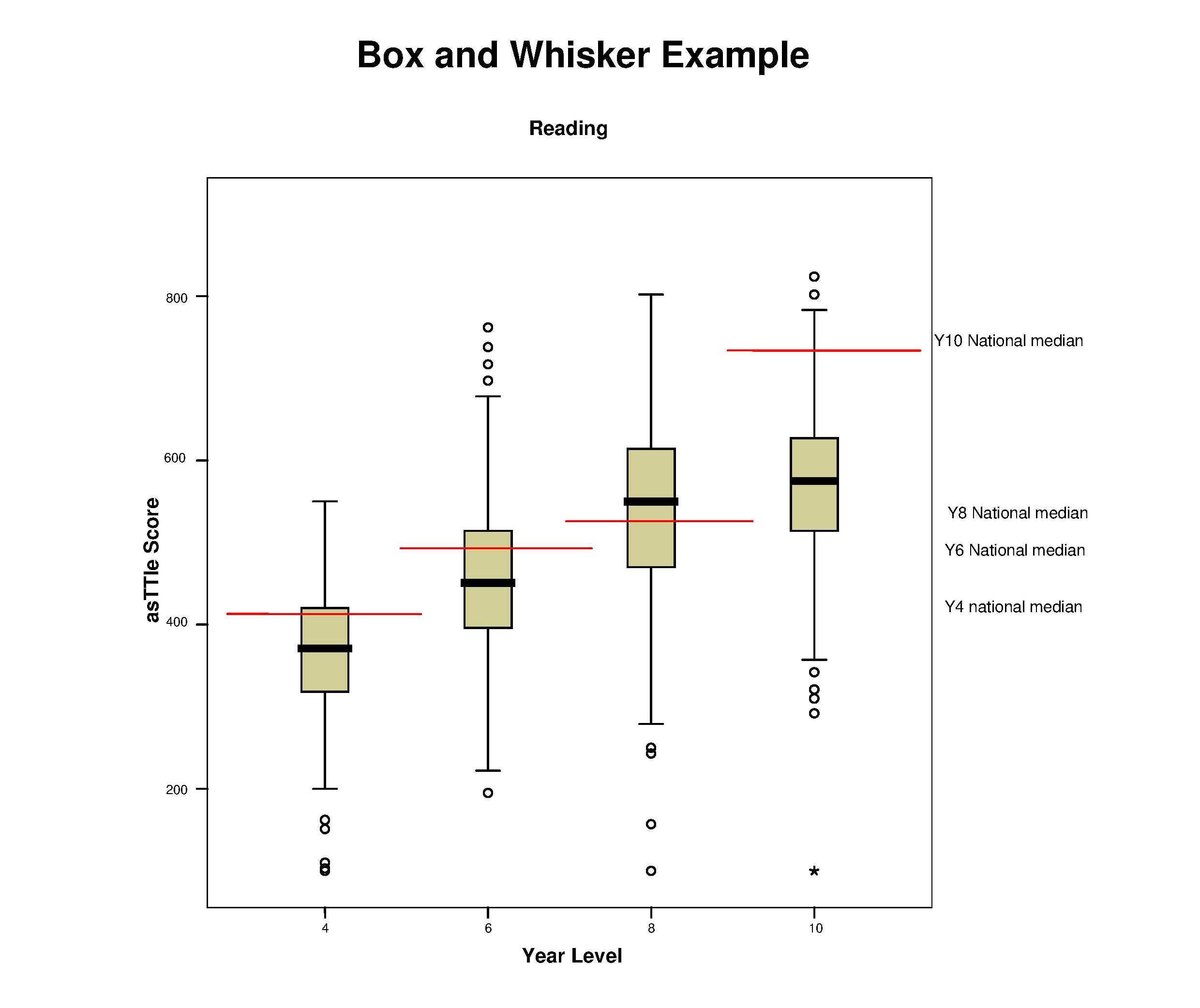
In this graph, achievement levels in reading are being compared. The left axis represents scores and the right axis represents the year level. The thick black line on each of the boxes represents the median for that particular data set. The thin red line represents the national median. The small circles represent outliers.
What the data shows:
- The medians for years 4 and 6 are below the National medians.
- The median for year 8 is above the National median.
- The median for year 10 is well below the National median.
- Each year level has a tail of underachievement which would need to be investigated.
- Top students in year 8 have higher achievement levels than those in year 10.
Areas for investigation:
- Data should be disaggregated to investigate if it is particular groups of students who are represented in the lower levels of achievement.
- Why are year 8 achievement levels higher than the others? Is it a direct result of exceptional teaching? If so, how can we share that capability across the other cohorts?
Overall goals for these groups of students:
- The obvious goal is to raise overall achievement for years 4, 6 and 10, but the goals would need to be much more specific than that after the data is disaggregated.

To create your own box and whisker graph using sample data, try the interactive illustration.
.