You are here:
- Home »
- Using evidence for learning »
- Reading and analysing data »
- Bar graph
Bar graph
A bar graph or bar chart is a chart with rectangular bars with lengths proportional to the values that they represent. The bars can be plotted vertically or horizontally.
Bar graphs are good for plotting data that spans a length of time (for example, for comparing achievement between the beginning and the end of the year) or they can be used for comparing different items in a related category (for example, achievement results for different classes).
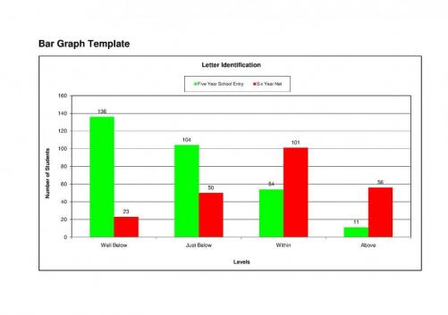
In this simple bar graph, achievement levels in Letter Identification are being compared. The left (vertical) axis represents the numbers of students, and the right (horizontal) axis represents achievement levels. The green bars represent the achievement of a group of students at school entry and the orange bars after one year at school. The differences between the two represent the progress made in student achievement levels over that time.
What the data shows:
- Only a small number of students who started school in the ‘well below’ category were still in that category after a year at school.
- The number of students in the ‘within’ or ‘above’ categories has more than doubled after a year at school.
- The number of students in either of the ‘below’ categories has reduced substantially.
Area for investigation:
- The total number of students is smaller in the ‘after one year’ figures. There are 305 students represented in the Five year school entry figures, and only 230 in the Six Year Net figures. This discrepancy would need to be investigated. Data which shows progress over time should always be matched, so that the same students are represented in both sets of figures.


